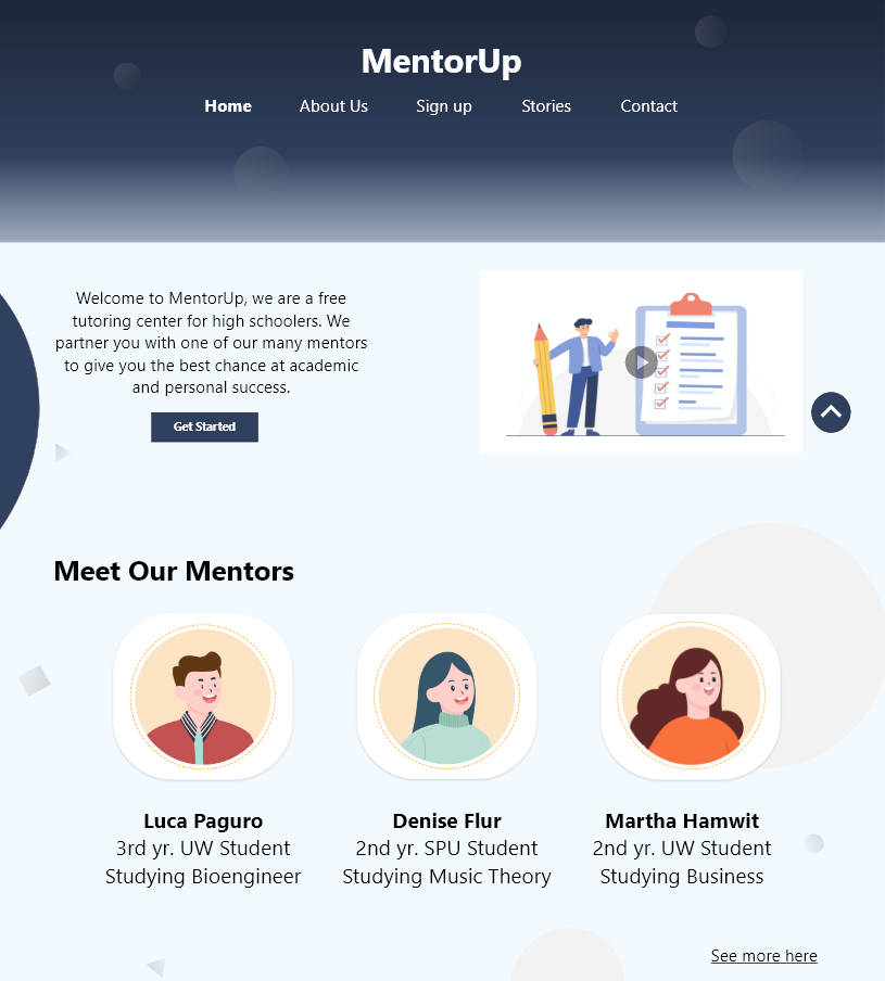
Partnering young bright minds with a mentor
High school students often need help navigating their lives, so I designed a website application to help partner them with mentors to give them the best chance at academic and personal success.
Role
UX Designer
Context
Case study
Contribution
Design, ideation, research
Tools
Adobe XD

WHAT’S THE CONTEXT?
Students that have difficulty in school often don’t know where to turn to for help. This habit could lead them down a spiral that can greatly damage their academic career. How can we address this issue?
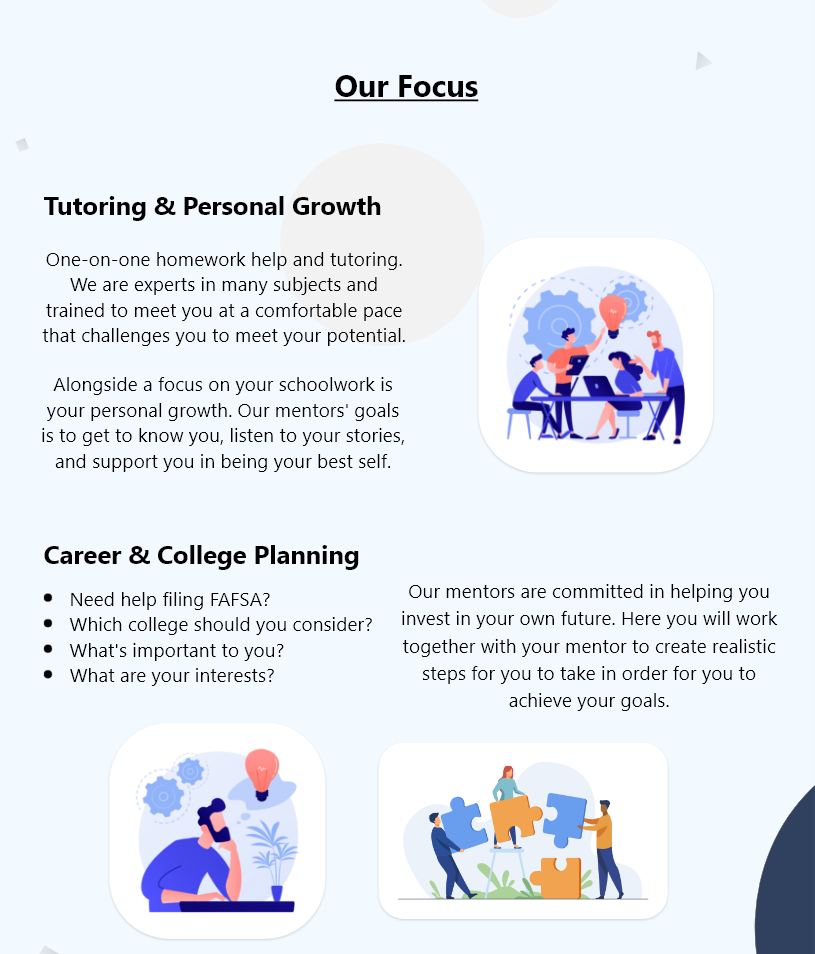
I created MentorUp as a way for high schoolers to connect with college students for tutoring and mentorship. Since they are only a few years older they are more relatable and have the foresight to understand the next steps to take to improve these high schooler’s academics and be prepared for college.
THE CHALLENGE
There are many tutoring centers and mentor programs that are online and sometimes even locally, what can MentorUp offer students that these other programs do not?
OUTCOME
I conducted a usability study with 5 participants and had them fill out a System Usability Scale (SUS) afterwards, the average SUS score was 95. This tells me that my design is easy to use on the surface level, however, the comments I received afterwards gives insight on how my design lacks certain details.

Competitive Audit
I performed a competitive audit for 3 websites, 2 for student tutoring programs, and 1 for mentors connecting with tech workers. I took a close look at each website to see what they did well, how they presented themselves, analyzed the sign-up process for ease of use and constraints, services they offered, and the overall use of the website.
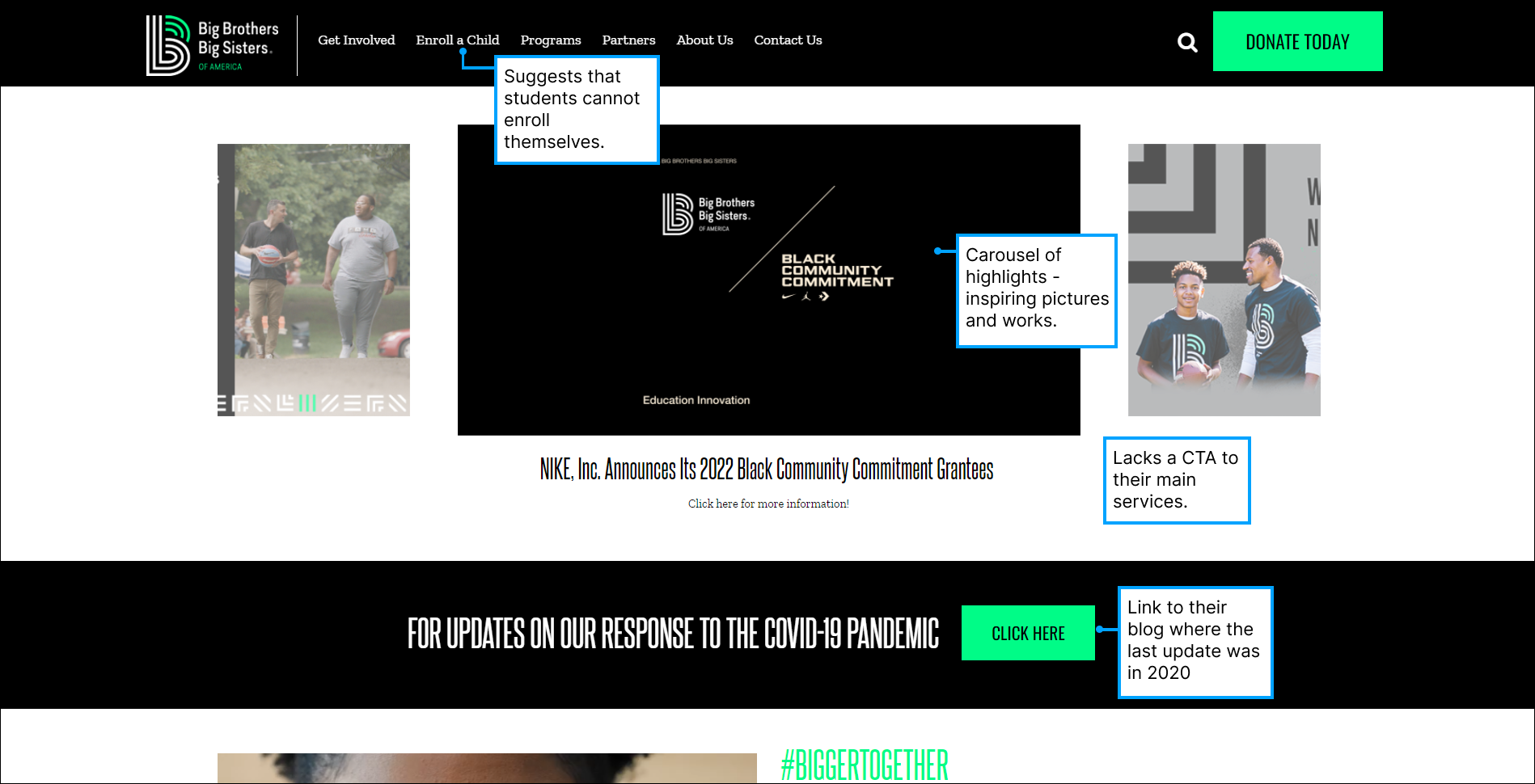
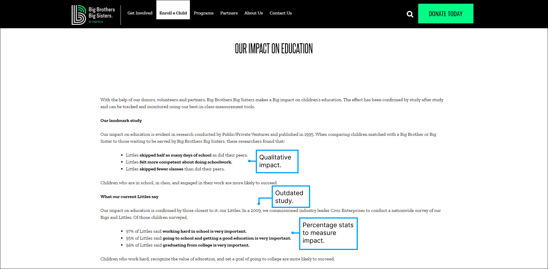
Big Brothers Big Sisters
Pairing Big brothers and sisters with their “littles.”
SkillsUSA
Setting up campus chapters aimed to inspire and nurture students to pursue STEM careers.

LEAN IN
Helping women achieve their ambitions and work to create an equal world.


Usability study
I conducted a usability study with users who are currently students, grades varying from high school to college. Here, I learned about their academic and personal experience, their particular needs and wants, and how their experience went with my wireframe.
Key insights

Takeaway
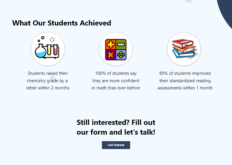
The website’s navigation flow was met positively with users, however the website needs to provide more context.
The users had no problem using the website to maneuver around and understanding the flow of it, their comments and SUS score is evident of this. However, their comments also mention that MentorUp is lacking in certain details. So, I took this opportunity to brainstorm details of the program that would answer more common questions that users may have before signing up.

Problem statement
How might we add more relevant detail into the webpage and differentiate ourselves from other similiar tutoring models?
Proposed solution
Next steps
My next steps would be to continue conducting user testing to see if I was able to solve the last iteration’s problem which was not having enough detail. With a high SUS score, I continued with the same flow throughout the website and just added more context to the program for users. Following up with this design, I would repeatedly iterate and test until it’s fine-tuned enough for a final design.
Conclusion and how I could have improved
I should have accounted for the fact that some students may not feel safe coming to a tutoring center because of Covid-19 and allowed for online sessions.
I didn’t address the challenge of how MentorUp was different from other programs.
I initially envisioned MentorUp to have more emphasis on mental health as our differentiating factor but I ended up focusing more on the academic aspect.
Done this project on Figma.